Infographics are one of the best ways to visualize the changes in healthcare, including Affordable Care Act provisions, Medicare’s payment formula for physicians, and even hospital readmission rates by state.
We would like to share the best healthcare infographics of 2015 below.
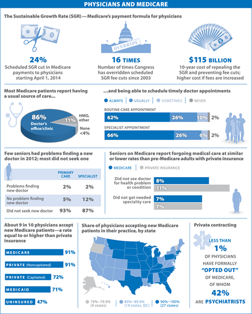
Physicians and Medicare
The Journal of the American Medical Association (JAMA) released this infographic showing the number of physicians accepting Medicare patients and the impact Medicare’s cut in payments had on patients.